From Ace Centre projects
Switch scanning frequency analysis
Analysis of the language of one user to improve scanning efficiency
Summary
Some individuals who use alternative methods of communication use partner-assisted scanning, in which letters will be verbally provided by a communication partner and the individual will signal “yes” for their chosen letter.
A typical letter arrangement for many alphabet systems is QWERTY, particularly for those familiar with a computer keyboard. For people using a scanning technique it has been proposed that a frequency organised keyboard is more efficient (Foulds, Balesta and Crochetiere 1975) as highly used letters can be accessed quicker.
This article discusses the analysis of an individual’s language who uses partner-assisted scanning and the principles behind making an efficient keyboard layout for communication.
Please note this work has been published and presented at AAATE 2017 and ATIA 2018 with Heidi Koester. The presentation for this can be downloaded here. A massive thanks to Heidi in steering us in the right direction! If you are interested in the world of text rate efficiencies do take a look at KPR’s new AT-node for Access. It’s an extensive database of all literature on the subject.
Background
Before we get down to the nitty-gritty of this work lets first cover some background; notably scanning and the letter frequencies.
Scanning
For individuals who are literate but unable to directly point to letters, an alternative access method is required. Some people may eye-point to letters and some may have a partner read out the letters to them. This can be done in a number of different ways using a communication partner – or using technology. The layout and form of these letters are often dependent on how an individual can access them. For example, this video demonstrates a purely auditory partner assisted scan in which each item is provided in a linear, list form. For more details on a range of scanning methods and ways to organise layouts have a read of “Getting started with AAC: Developing and using Alphabet charts” and “Switch Access to Technology: a comprehensive Guide”.
To speed up access to the alphabet many people decide to “block” the letters in groups. For example, some people say “A to F”, “G to H” for example. If we put this down on paper you can see that each “row” (“block” in this case) is followed by the letter. This is commonly called a “row-column” layout and is often found in high-tech devices [note] You can block items in all sorts of ways. Frode Sandnes suggests a really interesting way – by blocking a regular QWERTY chart into high frequency “blocks” so the scan path moves around to maximise efficiency. [/note].
Scan Steps
The efficiency of a layout for scanning can be measured by scan steps where each individual “step” or element in the scan is counted. In a row-column scanning layout, this is the distance travelled from upper left corner to final selection (Damper 1984, Lesher 1998). The image below shows the scan steps for each location in a 5×6 row-column, with the items in the top left being the fastest to reach and the bottom right the longest. For example, with an ABC layout as above, to select E is 4 scan steps, or to select U is 5 scan steps.
For our analysis, we start our scan steps at 0. You could start at 1 or 2 – the important point is that you compare like with like [note]Remember – this is not hits. Hits of a switch – or in the low-tech form a confirmation – is always consistent depending on the layout. In a row-column layout, for example, it will always be two switch hits (confirmations) per letter selection. [/note].
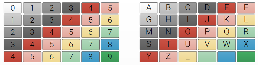
Fig 1. Scan steps for each location in a 5×6 row-column scanning grid (left).
The chart on the right shows this with a typical ABC chart.
Frequency of letters
So now to the interestng (!) world of letter frequencies.
If we were to read a book and keep a count of each time we saw a letter we would end up with a list of frequencies for each letter. For example, the phrase “Hello world” would have 1 “H”, 1 “E”, 3 “L”, 2 “O”, 1 “W”, 1 “R”, 1 “D” , and importantly – one space. We can create a Frequency list by dividing the sum of the number of occurrences of each character by the sum of all the characters in the corpus (in this case the sentence the total character count is 11 – and the frequency of H is 0.0909).
If we do this not just for one book – but many- we can find a general frequency list. The interesting thing is that this list is largely the same across different texts. For example, by analysing the Oxford English dictionary it is “EARIOTNSLCUDPMHGBFYWKVXZJQ” and an analysis of 40,00 words by Cornell gives “ETAOINSRHDLUCMFYWGPBVKXQJZ”.
There are some letter differences – but you can see that the letters are largely within the same frequency. These differences occur due to the context; for example, a book on x-rays would have a large amount of’ “X”s used (for more information have a read of this Wikipedia page on the subject). So there are subtle differences across authors and the types of thing being written about [note]There is of substantial differences across languages too. This chart shows some of the common frequencies in different languages. [/note] [note]This is roughly the same across texts – even small texts show a lot of similarities. The distribution is similar to whats known as a Zipf distribution[/note].
One of the largest datasets for analysing this frequency of use is to use the Google books dataset. In 2012 Peter Norvig analysed this data providing word and character counts in all of the scanned books by Google (its a LOT of data!). The graph below shows the frequency of these letters with the most frequent at the top (numbers are in billions).
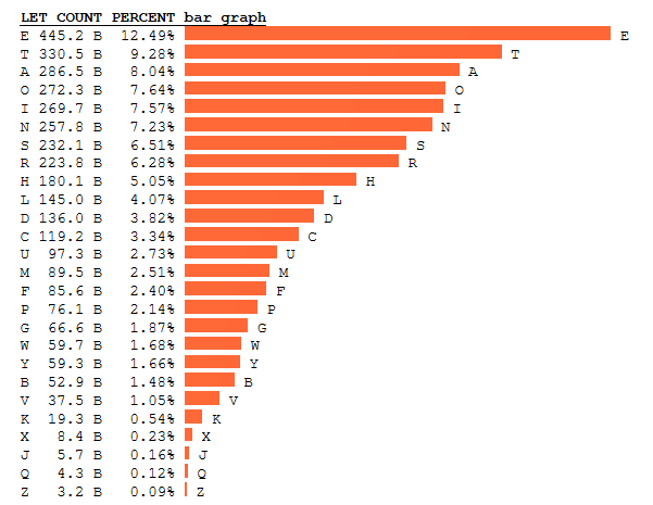
Fig 2. Norvig’s letter count frequency, taken from Norvig.com
Note how the “top twelve” letters constitute about 80% of the total usage. The “top eight” letters constitute about 65% of the total usage. Also, note how the letter “B” is only 1.48%. Of course, in a typical linear list of scanning of letters in a ABCD order, this is the second item – you may start to wonder if this is that efficient.
As a result of these frequency charts some authors have suggested that when accessing the alphabet using a scanning method, it would be beneficial to order the letters based on frequency. For example, the EARDU arrangement (Koester and Levine 1994) is a common layout seen in AAC software when using a scanning frequency layout [note]Notice how we have conveniently ignored numbers and punctuation. This is partly because we are concerned about low-tech (partner assisted ) scanning. If you look at this frequency list that includes numbers and punctuation, space is far and above at the number 1 position with numbers and punctuation starting about the 21st position (1.24%). Worth thinking about later when we look this on high-tech[/note] [note] Some studies suggest that you can learn this layout relatively quickly. Bear in mind we aren’t discussing touch typing here, where you have to shift attention – but scanning where visually you can attend to the screen. [/note].
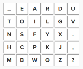
Fig 3. From Scanning Wizard.
Efficiency of a layout
There are a number of ways you can define the efficiency of a layout [note]More on this can be found in this paper [/note]. A quick way though is to simply sum the letter frequency and times it by the scan steps for each letter. For our analysis, we total these figures to give an efficiency number of the chart. For the purposes of this paper we will call it the SxF sum. [note]Another way (& maybe better way) is to consider the frequency of words. Scott Mackenzie discusses this in his paper. Follow our results at the end to see how our work compares with Scott’s data. [/note].
SxF per char = (Num of Occurences of Char / Sum of All Chars) * Scan Step for Char

Total SxF = Sum(SxF per Char)
The smaller the number the more efficient it is. Remember though – this number will differ depending on the language used to measure the frequencies.
Meet David
In 2010 David had a brain stem stroke. This has affected all areas of his life – leaving him with no speech and very limited motor control; minor movement in his right thumb, flexion of his jaw and looking up to indicate “yes”. He is dependent on others for his daily needs and care.
Directly following the stroke, David was provided with an alphabet chart by his Speech & Language therapist. The layout of this can be seen in Figure 4. and for the purposes of this work, we are defining this as an “EATSROIN” layout. David spells his messages using row-column auditory scanning – looking up to signify “yes” when the desired row and then the letter is reached. David and all his communication partners have memorised his layout, which makes it a very fast and efficient method for him.
- Communication Partner: Line 1.. Line 2.. Line 3
- David: Looks up to indicate “yes” to Line 3
- Communication Partner: W.. C.. K.. Y..
- David: Looks up to indicate “yes” to the letter “Y”
- Communication Partner will then begin from the top again to select the next letter
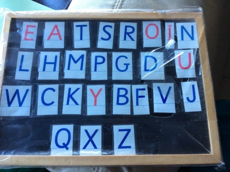
Fig 4. Individuals partner-assisted scanning alphabet chart (“EATSROIN”)
David and his team have clear guidelines between themselves when it comes to using this system. All communication that David makes is written by hand in notebooks by the carers. They predict spaces and words if possible as David spells – and note that this is done by writing – not by the communication partner speaking (The video is a little hard to track without seeing this written note from the communication partner but he is saying “she thinks..”). David will either spell numbers or at the appropriate time, his communication partner will read out numbers for him to select.
The Ace Centre was referred to see David for an assessment under the NHS contract for AAC to look at making his communication more efficient and providing him with an independent way of generating his speech. One of David’s main goals was to make a speech at his daughter’s wedding.
Part 1: Low tech partner-assisted scanning efficiency
Aims
When we met David, he demonstrated how quick and efficient his communication was with his support workers; you can see this in the video above. Watching David and looking at his chart raised questions and thoughts for us. It was clear that a Speech & language therapist in his hospital setting had looked up a frequency chart and provided it to him – but it wasn’t being presented linearly. It was provided in a row-column format.
- Is this EATSROIN layout, which is being presented in a row-column order, the most efficient layout for his communication needs?
- What layout should we be offering to clients when they are partner assisted scanning?
- Do we need to analyse data from all of our clients to give them a suitable low-tech frequency layout? (i.e. is his language different to others or from written texts?)
Method
To have a better understanding of prediction and how David’s carers are using it to reduce the number of letters David needs to spell, we asked them to annotate each time a correct prediction was made; this was shown by using a pipe.
Fig 5. Extract taken from language sample, demonstrating prediction
After 3 months of data were collected, all notebook entries were transcribed and analysed for frequency. The number of times each letter had been selected, which letters had been predicted and all the words that had been entered were calculated using a simple script [note]See VocabAnalysis.py if you want to do this yourself[/note].
We can analyse the number of steps to select each character across different charts and make estimations of time savings to “say” all his vocabulary across these different charts. For this space was taken as the same length of time as the first letter in each chart. This was because despite having no space in his own chart his communication partner “guesses” the word and a confirmation from David acts as the space. We estimate this is the same as “First Row, E” spoken aloud. For the entire code to run this yourself have a good look at our page here. The layouts (David’s original – EATSROIN, ABC, AEIOU, EARDU, QWERTY) are shown graphically below. The steps for each of these can be seen in this directory (see *-nospace.csv variants).
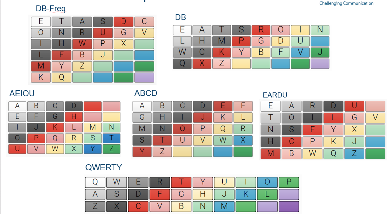
Fig 6. Example grids. Note, just as in Davids Chart we have no space element.
Results
After transcribing David’s language sample, the frequency of letter usage was obtained. The table in Figure 7 below shows the most frequent letters at the top and how many times the letter was used.
The vocabulary analysis also shows us that;
-
- David had spelt a total of 30924 letters
- This encompassed 7731 whole words
- 568 of these were spelt with prediction from Davids communication partners
- There was an average word length (including the predicted words) of 4 letters
- The average words used per sentence was 5.25. The maximum was 28.
- Of all the words, David repeated 719 more than once.
- If we compare his words with Susan Balandin’s core word list we see 171 of his words used are “core” (more on this later!).
- 148 core words were repeated more than 10 times
Note the amount predicted is lower than you may have been expecting. This is understandable; we were asking a number of communication partners to adapt the way they write in their notebooks – which may have slowed them down considerably at times. Just watching him communicate with his partners we feel the number should be much higher. As a consequence, we have ignored the predictions for the analysis and assume he spells all of the words. Note the flaws in this assumption; the details as to when and how his partners predict could massively skew our time estimations.
| Letter count | Frequency | Letter | Scan Steps | Scan Steps x Freq (SxF) |
| 6260 | 0.16835198 | _ | 0 | 0 |
| 3391 | 0.09119514 | e | 0 | 0 |
| 2861 | 0.0769417 | t | 2 | 0.15388339 |
| 2656 | 0.07142857 | o | 5 | 0.35714286 |
| 2399 | 0.064517 | a | 1 | 0.064517 |
| 2346 | 0.06309165 | n | 7 | 0.44164157 |
| 2081 | 0.05596493 | i | 6 | 0.33578959 |
| 1732 | 0.04657917 | r | 4 | 0.1863167 |
| 1725 | 0.04639092 | s | 3 | 0.13917276 |
| 1507 | 0.04052818 | h | 2 | 0.08105637 |
| 1346 | 0.03619836 | l | 1 | 0.03619836 |
| 1226 | 0.03297117 | d | 6 | 0.19782702 |
| 960 | 0.02581756 | u | 7 | 0.18072289 |
| 830 | 0.02232143 | w | 2 | 0.04464286 |
| 804 | 0.0216222 | f | 7 | 0.15135542 |
| 768 | 0.02065404 | m | 3 | 0.06196213 |
| 756 | 0.02033133 | c | 3 | 0.06099398 |
| 733 | 0.01971278 | g | 5 | 0.0985639 |
| 683 | 0.01836812 | p | 4 | 0.07347246 |
| 647 | 0.01739996 | b | 6 | 0.10439974 |
| 533 | 0.01433412 | y | 5 | 0.07167061 |
| 429 | 0.01153722 | k | 4 | 0.04614888 |
| 348 | 0.00935886 | v | 8 | 0.07487091 |
| 83 | 0.00223214 | x | 4 | 0.00892857 |
| 45 | 0.0012102 | j | 9 | 0.01089178 |
| 24 | 0.00064544 | z | 5 | 0.00322719 |
| 11 | 0.00029583 | q | 3 | 0.00088748 |
Fig. 7. The final frequency of Davids letters spelt in order of frequency. Note this includes predicted words due to the small amount we have recorded as predicted. Davids total Steps x Frequency number (SxF) is 2.99 for the EATSROIN layout presented in a row-column layout when comparing to his own language.
When David’s calculated letter frequency and Norvig’s Google Books frequency are compared there are some minor differences. For example A & O have swapped position as well as N & I, and S & R. There may be some contextual issues that are leading to some increases in frequency – the letter W was more frequently used than in Norvig’s data. With David preparing for his daughter’s upcoming wedding, it may have led to an increased use of the letter “W”.
Fig 8. Clients frequency vs Norvig frequency in the order of Clients Frequency. Note we are excluding the space from our analysis for this chart to compare frequencies similarly.
So there are some differences when comparing to the Norvig frequency list. Let’s imagine we layout a new chart based on the frequency of his character usage. It’s pretty straightforward to do. In the order of frequency write down the letters in lowest scan step number until you reach the end. It would look something like this:
Fig 9. Reorganised layout around David’s own language.
Note this would give a Scan x Frequency (SxF) number of 2.11 for his vocabulary. This gives us a reduction of 0.88 but would it be any faster in reality? And how does this compare to other layouts? We can make some estimations but be aware that to do this we have to make some assumptions:
-
-
- It is a 1-second scan rate (for rows and cells)
- All selections are made at the end of the second
- Every space/ confirmation takes 2 seconds, same as the first item in the layout (Is it “Dog”?)
- David and his communication partners make no mistakes! (ie. no error correction)
- No words are predicted, David spells everything in full
-
These are some big assumptions. Does it really take 2 seconds (the same as to select the first letter in the chart) for the partner to suggest the word? Is it wise to really ignore prediction? Surely the partner skips through letters faster where its unlikely to be? These are all good questions and ones that need further research (We will touch on this a little later when we analyse his communication).
The table below shows the scan steps required to spell all of David’s 3-month sample in each of the different alphabet arrangements and the estimated time it would take to produce. The right-hand column shows the percentage improvement it would take in comparison to David’s original layout.
| Layout | SxF | Estimated time | % improvement |
| EATSROIN – Current layout | 2.99 | 2d 3h 34:53 | 0 |
| Reorganised | 2.10 | 1d 18h 31:13 | 19.26% |
| EARDU – Common frequency | 2.17 | 1d 19h 7:16 | 17.87% |
| ABCD | 2.98 | 2d 3h 31:39 | 0.10% |
| AEIOU | 3.91 | 2d 13h 11:3 | -17.03% |
| QWERTY | 3.97 | 2d 13h 41:50 | -17.86% |
Fig 10. Time estimations based on David’s transcription
Remember this table shows estimations from just 3 months sample of his language. If for we were to use a different corpus for analysis [note] For example the BNC Baby corpus – and only looking at the spoken corpus – which accounts to approx 30,000 words – a 4x increase of Davids vocabulary – Instructions on how to parse the exact data for this analysis is here [/note] – we would see that using a reorganised layout would give a SxF number of 3.98. An SxF number is only an indication of the efficiency of layout depending on the language which changes across time (It’s for this reason that some authors have suggested that a different scanning technique that incorporates prediction may be more useful for high-tech). Interestingly – the normal frequency layout (EARDU) gives a SxF of 2.4 – which is much closer to the 2.17 seen above.
With David’s language, we are seeing QWERTY as having a SxF number of 4.77 and can see its substantially slower in our time estimations [note] In previous publications of this work we made the mistake of using a space in the QWERTY layout. We feel this causes some misunderstanding about the results hence presenting it this way now [/note].
But what if we were to consider the prediction? Let’s assume that we really do have an accurate dataset for the amount predicted. Let’s now remove that from our calculations and look at the differences (for simplicity I’m ignoring all charts but his own re-organised prediction layout).
| Totals | Steps | day:hr:min:s | % improvement |
| EATSROIN (Original Layout) | 88932 | 1:20:32:42 | 0.00 |
| Reorganised layout around David’s language | 84758 | 1:19:23:08 | 7.03 |
Fig 11. Prediction details. Note 568 words predicted which equates to 4.8% of the total.
So there are savings to be made. We could imagine that if we had better data for the predictions the improvements may be even more significant.
A breakdown of real timings
Making assumptions and predictions of low-tech scanning should be dealt with huge sceptism! If we watch the short video which demonstrates David spelling we can measure the time for each letter.
| S | H | E | – | T | H | I | N | K | S |
| 2.21 | 3.03 | 0.92 | – | 2.35 | 8.30 | 4.90 | 9.53 | 4.30 | 2.95 |
Fig 12. Stop-watched times (seconds) to select each character.
The sum of these times is 35.56 seconds with a mean selection time of 3.23 seconds.
Some comments:
Note that when the communication partner gets to ‘E’ of SHE they move on to ‘T’. They assume it’s a whole word and only correct if he continues looking down. If he gets it wrong THEN they ask is it correct (which we don’t see in this video). In our estimations, we have taken the assumption of 2 seconds to be – on average – this time for a space but in reality, it may be far shorter. In future predictions like we have attempted a +/- range may be more useful to the reader.
This technique of continuing to look down to note an error can be seen when he gets to ‘H’ and ‘N’. The partner made a mistake in reading is eye movements so started again.
The technique certainly seems more efficient than a partner saying out loud “She?” and then moving on – but this would need further investigation.
Conclusions
- SxF numbers (or other similar metrics) give an indication of how efficient a system is – although these need to be considered depending on the corpus of text.
- Frequency layouts are more efficient than QWERTY (approx 30-40%). This isn’t by any means new information. Anecdotally we know therapists may prefer to present a client with an ABC or QWERTY chart over a frequency chart. In many cases this is suitable when an individual, and importantly their communication partners, finds it too difficult to move to a different layout. However, this should be done knowing that significant increases in production of communication can be made by changing a chart.
- Consider carefully how an individual is going to use the chart. Is it Linear, Row-Column, Block? If so bear in mind the layout may need to be adapted.
- Try and find a technique for eliminating the space – and any other characters (numbers etc). The space is almost double the amount than a letter the first highest character. By using an objective system to show what the current letters spelt (e.g. writing) is not only useful for the communication partner but provides a shared understanding of the current word. With the partner guessing the end of the word a correction is more useful than a space.
- Using an individuals own language to layout an alphabet board has marginal improvements in the short-term. Using a short-term language sample may in fact be detrimental to organise an alphabet board with given that frequencies will change over time. Using a frequency chart is advisable where you can
- Further research into the details of communication partner skills and the nuances of prediction are required
David: 18 months on
Approximately 18 months after we first met David he continues to use partner assisted auditory scanning as a main method of communication. After discussion with him, he has preferred to stay with his current layout. David was introduced to a high-tech device which provided him with voice output. David quickly began using a row-column scan, accepting letters by a switch activation of a very small jaw clench (using BrainFingers). Over a few months, David began using his device to control his environment, text his friends and family and search the internet.
David was able to use his device to prepare his father of the bride speech and is now writing a book about his journey. We will cover the decisions about his high-tech system in a follow-up post.
References
Damper, R. I. (1984). ‘Text composition by the physically disabled: a rate prediction model for scanning input’. Applied ergonomics, 15(4):289-296.
Foulds, R., Baletsa, G., & Crochetiere, W. (1975). ‘The effectiveness of language redundancy in non-verbal communication’. In Proceedings of the Conference on Devices and Systems for the Disabled (pp. 82-86). Philadelphia: Temple University Health Sciences Centre
Garay-Vitoria, N., and Abascal, J. (2005). ‘Text prediction systems: a survey’. Universal Access in the Information Society 4: 188-203.
H. Koester & S. P. Levine (1994). `Modeling the speed of text entry with a word prediction interface’. Rehabilitation Engineering, IEEE Transactions, 2 (3):177-187
Lesher, G. W., Moulton, B. J. and Higginbotham, D.J. (1998). Techniques for augmenting scanning communication. Augmentative and Alternative Communication, 14 (2):81.
Norvig, P. (2012) English Letter Frequency Counts: Mayzner Revisited or ETAOIN SRHLDCU. [online] available at: http://norvig.com/mayzner.html. [Accessed 16 February 2017]