
The Ace Centre’s free alphabet charts have been a go-to resource for supporting face-to-face communication for someone who is able to spell but cannot rely upon speech to communicate. Originally developed to complement our Designing and Using Alphabet Charts and Using Alphabet Charts and Paper-Based Resources to Support Communication for Adults with Progressive Conditions eBooks, we thought about what we could do to improve the charts to make them more accessible to more people and have released updates and new features to do just that.
Below we hear from Katharine Buckley, Senior AAC Consultant at Ace Centre and lead contributor to both the eBook and alphabet charts, about this exciting development and things to consider when downloading a resource.
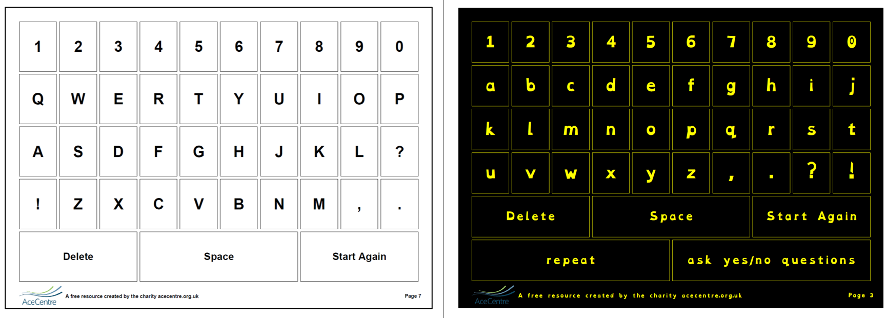
What’s new about the alphabet charts?
In the past when you were looking for an alphabet chart to use with someone who can point, we had many different layouts to scroll through. Now you will find one chart BUT we’ve added a feature that will allow you to make decisions on how the charts will look and then provide 10 variations of layout in the download. You can then print the one you want to use or several to try out with the person who needs them. Check out this customisable alphabet chart by clicking here.
We have also added a help sheet to assist people new to paper-based AAC. It provides signposts on learning more by checking out our Designing and Using Alphabet Charts and Paper-Based Resources to Support Communication for Adults with Progressive Conditions eBooks and some of our Ace Centre Learning courses.
Who are the customisable alphabet charts for?
The customisable alphabet charts are for people who can point to the letters on the chart using a finger or other body part. Alphabet charts that can be accessed in other ways are still available for download on our website – they just can’t be customised yet.
Alphabet charts can be used to support face-to-face communication with someone spelling out whole words and sentences. A chart may also be used by someone whose speech is not reliably intelligible to cue a communication partner into what they are saying by perhaps pointing to the first letter of each word as they speak.
Alphabet charts also have an important role to play in the communication system of people using symbol-based communication systems. An alphabet chart can give experience of using letters and support developing literacy skills. For more information about this, see Chapter 4 of the Getting Started with Paper-Based Symbol Resources eBook.
Why did you decide to add the customise options?
We know tweaking a feature or two of an alphabet chart can make it more suitable for an individual. One change might help someone to see it better, another can help someone to point to the letters more accurately and others could mean someone likes the look of it a bit more and decides to use it! Chapter 9 in Designing and Using Alphabet Charts eBook explores some of these issues in more detail.
What can I customise on the charts?
There are two levels of options to edit. The basic level includes choosing the colour scheme, whether to include YES and NO, casing (i.e. upper or lower case) and which font to use. The more advanced level gives control over spacing, the case of the commands, border thickness, labels and the colour of the background, borders and text.
What should people consider when customising the options?
There are lots of things to consider and everyone will be different. For many the default option may be fine but for others you may want to carefully consider the following:
Basic options
Colour Scheme: This allows you to select between a number of pre-set colour schemes. Black and white will use the least printer ink. However, there are some more colourful options to choose from which some may prefer. There are also two high contrast options – black on yellow and yellow on black that may help someone with certain visual issues to see the letters more clearly.
Empty Spaces: Some of the charts have two spaces available for personalised messages. This gives you the option of putting the words ‘yes’ and ‘no’ when there is space. Most people will already have their own ways of communicating ‘yes’ and ‘no’, but some may appreciate having a back up method. Note that the option YES/NO places ‘yes’ on the left and ‘no’ on the right and the option NO/YES places them the other way round. If you would prefer not to include ‘yes’ and ‘no’ on the relevant charts, select the option Leave Empty.
Note, to include personalised messages on the chart, see the advanced option Labels below.
Casing: The alphabet chart can be in lower or upper case. Typically, children in education will be more familiar with lower case letters but it is really down to personal preference.
Font: There are four fonts to choose from including OpenDyslexia, designed to increase readability for people with dyslexia, and Atkinson Hyperlegible, designed to increase legibility and readability for people with low vision or visual issues.
More advanced options
Spacing: As each letter of the alphabet sits inside a cell / box on the chart, there is an option to adjust the amount of space between each cell to support someone who has difficulties accurately pointing. Experiment with increasing the space between each cell to give more margin for error. It is a relative scale with the least amount of space between the cells at 1 up to the most amount of space available at 10. Creating more space between each cell may also help with visual accessibility as it separates out each letter, reducing visual clutter.
Command Casing: This is where you can select the casing of commands like ‘space’ and the two personalised messages (if used). Capital Case capitalises the first letter of each word in a phrase i.e. Start Again while Sentence Case capitalises the first letter of the first word in the phrase only i.e. Start again.
Border Thickness: On the default alphabet chart, each letter sits in a cell with a narrow border. It is possible to adjust the thickness of this on a relative scale from 0 (i.e. no border) to 10. The default setting is 0.5. The thickness of the border can affect visual access – sometimes a thick contrasting border can be helpful in optimising visual access.
Labels: There are three default commands on the alphabet chart: DELETE, START AGAIN and SPACE. Here you can elect to rename these to whatever you prefer e.g. backspace, clear, next word, etc. First Empty Space Label and Second Empty Space Label is where you can type your own useful messages into the two empty spaces on some of the charts e.g. “Hello, how are you?”, “I need help”, “I’m in pain”, “Please phone Mum”, “Please adjust my leg strap” etc. If you prefer to handwrite these messages, leave this option blank.
Colour of the Background, Borders and Text: These options give you total control over the colour scheme of the alphabet chart. To save ink, stick with the default option of a white page background and cell colour with a simple black font. But sometimes including someone’s favourite colour might just be the trick to pique their interest. You can even type in the hex reference of a specific colour if their favourite shades aren’t on offer!
People with visual issues could benefit from the use of high contrast colour schemes. A black background with yellow cells is often the most familiar. However, there are lots of different high contrast combinations and one of these alternatives may enhance the visual accessibility of the chart. There is a lot of information on the internet which can provide guidance, click here to visit one website we recommend.
Try out all these features by clicking here.
What do I do if customising doesn’t help?
If you try working with these features but someone is still unable to see the letters and / or physically select them, please don’t give up as there are lots of different ways to support their communication! You could consult our Designing and Using Alphabet Charts and Paper-Based Resources to Support Communication for Adults with Progressive Conditions eBooks, or book a free online session through our Information Appointment service to chat things through with our clinicians by clicking here. You can also drop us a line via email [email protected] or give us a call on our advice line 0800 080 3115.


